Jetpack Compose: The Future of Android UI Development
April 7, 2025
codolis blog header
Blog
Jetpack Compose: The Future of Android UI Development
Since its announcement by Google in 2021, Jetpack Compose has rapidly become a game-changer in Android native UI development. Designed to simplify UI creation, it enables developers to build modern, responsive interfaces with less code and greater efficiency. Unlike the traditional XML-based approach, Jetpack Compose embraces a declarative programming model, making UI development more intuitive and adaptable to real-time changes. Engineers can define UI components using Kotlin, leading to faster development cycles, better maintainability, and enhanced performance.
Composable Annotation in Jetpack Compose
In Jetpack Compose, UI components are defined as Kotlin functions annotated with @Composable. These functions, called composables, render UI elements dynamically. When a value changes, the UI updates accordingly through a process called recomposition. To use composables in an activity, employ the setContent {} function, which is an extension of ComponentActivity from the androidx.activity:activity-compose dependency. Within Fragments, composables require a ComposeView.
TextView to Text
Text is the direct replacement of TextView. It includes all standard TextView customizations and many more. Customizations can be passed directly as parameters to the composable. You can extract all customizations into a TextStyle that you can use through your app. You can provide a TextStyle directly into a Text as a parameter or via theming.
EditText to TextField
In Jetpack Compose, user input is handled through the TextField composable. Unlike EditText, TextField doesn’t store the value internally; instead, it accepts the value as a parameter and uses a callback to handle text changes.
Key Features
Value as a parameter – The text value is passed in rather than stored within TextField.
Text change callback – You can easily handle text changes using a callback.
Material Design support – Fully supports Material Design elements like:
Hints
Outlines
Leading and trailing icons
Variants
OutlinedTextField – A version with an outlined border for the text field.
BasicTextField – A more basic, unstyled version for maximum customization flexibility.
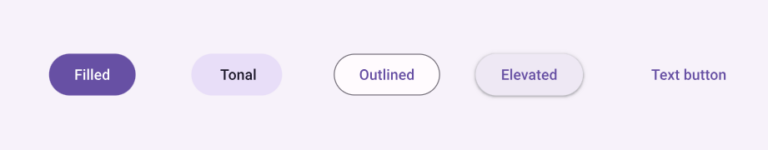
Buttons in Jetpack Compose
Compose offers a variety of Button composables for different use cases. Each button handles click listeners and interactions, while receiving a content composable (such as text or icons) for its contents. Rather than requiring custom styling to match Material Guidelines, Compose provides pre-built buttons that suit various UI needs. These include:
Button – A standard button for general use.
OutlineButton – A button with an outline, useful for secondary actions.
TextButton – A button with only text, typically used for links or simple actions.
IconButton – A button designed to hold an icon, often used for actions like navigation.
Displaying Images & Photos
In Android XML, you typically use an ImageView to display images like contact profile photos, gallery pictures, or images from the web. In Compose, the equivalent composable is Image.
The Image composable handles image rendering features, including content scaling. However, it does not load resources (such as drawables) directly. Instead, it relies on its parameters to manage this functionality. Depending on the image source, you’ll use one of the following:
Painter – For drawing images from various sources like resources or URLs.
ImageVector – For vector images, typically used for scalable graphics.
ImageBitmap – For bitmap images, such as rasterized images.
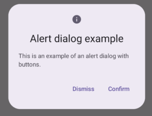
Dialogs and AlertDialogs
In Compose, dialogs are part of your layout definition, unlike classic Android dialogs. It’s your responsibility to control when to display or hide the dialog based on the UI logic.
There are two types of dialogs in Compose:
Dialog – Accepts a content composable, allowing for fully customizable dialog layouts.
AlertDialog – A more structured variant that takes specific composable functions as parameters for different parts of the dialog, such as the title, text, and buttons.
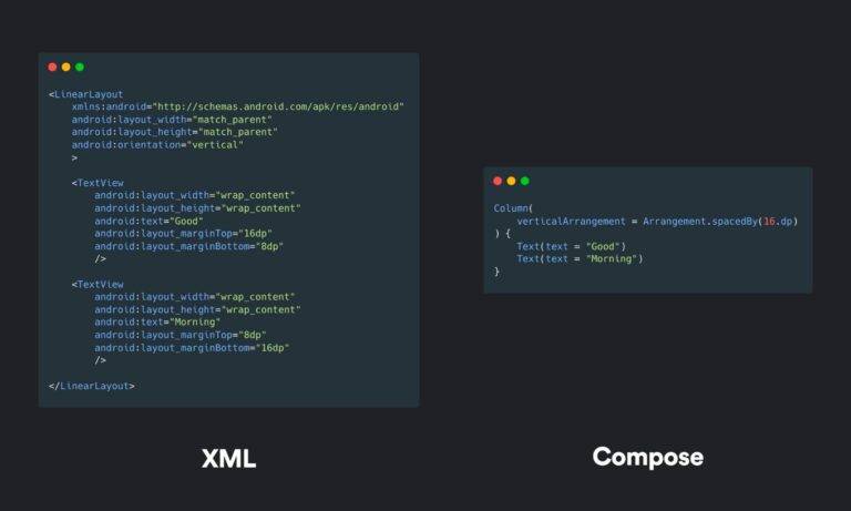
LinearLayout to Column & Row
In Compose, the Column and Row composables are used to arrange content in vertical and horizontal layouts, respectively.
A Row behaves similarly to a LinearLayout with a horizontal orientation.
A Column, on the other hand, functions like a LinearLayout with a vertical orientation.
Both composables offer similar functionality to LinearLayout, such as support for weight and gravity, allowing you to control the distribution and alignment of content.
For a simple layout, you can use a Column to stack elements vertically. If you need a horizontal arrangement instead, simply switch to a Row, and the layout will adjust accordingly.
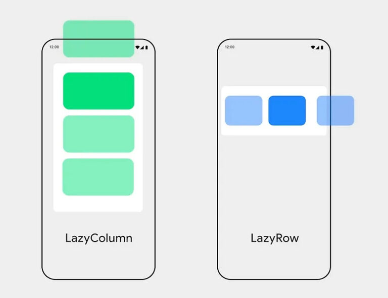
RecyclerView to LazyLists
Compose simplifies the creation of both horizontal and vertical scrolling lists, eliminating the need for Adapters and Viewholders. There are two types of scrolling lists:
LazyColumn – For vertical scrolling lists.
LazyRow – For horizontal scrolling lists.
Instead of using view holders, each item in the list is wrapped inside an item {} function, making it much more straightforward to build and manage lists.
ConstraintLayout in Jetpack Compose
In the traditional View system, ConstraintLayout is the recommended choice for building layouts. It offers the advantage of a flat hierarchy, which improves performance compared to more traditional layout methods.
In Compose, however, there are no such limitations. While simpler layouts can be easily built with Row and Column, ConstraintLayout is still available as an option when layouts become more complex.
Key Points about ConstraintLayout in Compose:
No Flat Hierarchy Limitations: Unlike in the View system, Compose doesn’t require you to use ConstraintLayout for performance reasons, but it remains useful for complex layouts.
Useful for Complex Layouts: When nesting Row and Column becomes difficult to manage, ConstraintLayout offers a more structured approach.
Positioning with Constraints: You can place composables based on constraints you set. The process involves:
Using createRefs() to define references.
Linking each composable to a reference using Modifier.constrainAs() to apply the constraints.
This method allows you to easily build responsive and flexible layouts even for complex UI structures.
Compose on the other hand does not come with this limitation. ConstraintLayout is used as an alternative way of defining layouts. It becomes useful when the layout is fairly complex and nested Rows and Columns make the code harder to read. ConstraintLayout places each composable according to the constraints you set to it. Use the createRefs() to define the set of references you will use in your layout. Then in each composable, use Modifier.constrainAs() to link each composable to the respective reference and apply the constraints you need.
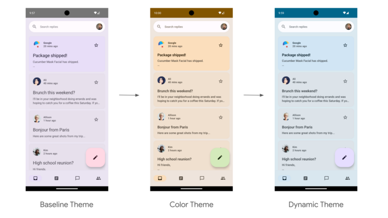
Theming your Jetpack Compose application
App theming in Compose differs from the traditional View system but is much more intuitive.
The theme in Compose is a composable function that wraps the elements you need to style. It’s usually placed as the top-level composable in your app, unless there’s a special use case that requires a different setup.
Key Components of App Theming:
Typography: Defines the text styles used throughout the app.
Colors: Specifies the color palette for various UI elements.
Shapes: Defines the corner radius and shape styles for elements.
Each composable function within the app accesses and applies the theme’s values to style its content. This makes it easy to manage and apply consistent styling across your app.
For more detailed guidance on Jetpack Compose, you can visit the official documentation here.
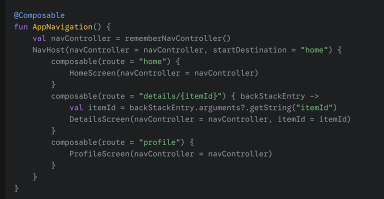
Defining the Navigation Graph
The navigation graph is a central component that defines all the possible destinations (composables) in your application and the paths between them. You typically create a composable function to define this graph.
Navigating Between Composables
We can navigate to a specific route using the navController.navigate(route) function.
Simple Navigation: To navigate to the “profile” screen, we simply call navController.navigate(“profile”).
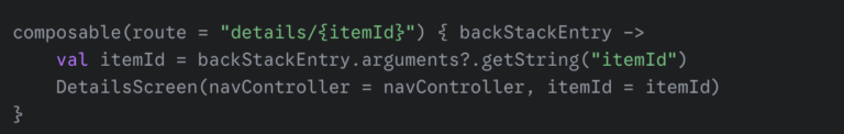
Navigation with Arguments: We can define routes with placeholders for arguments, like “details/{itemId}“. When navigating to such a route, we need to provide the actual argument value: navController.navigate(“details/123”).
Going Back: To navigate back to the previous screen, we can use navController.popBackStack().
Passing Data Between Screens As seen in the “details” route example, we can pass data as part of the navigation route.
Define the Route with a Placeholder: In your NavHost, define the route with a placeholder enclosed in curly braces: composable(route = “details/{itemId}“).
Navigate with the Data: When navigating, provide the actual value for the placeholder: navController.navigate(“details/123”).
Retrieve the Data in the Destination Composable: In the DetailsScreen composable, we can access the passed data from the NavBackStackEntry